A software studio’s marketing site — the brand, the interface and everything underneath it, and the starting point for the site you are reading now.
Status
Live
My part in it
I designed and built the whole thing: the brand, the component library, every screen, the motion and the accessibility work. V Source is a client; I contract to them.
Built with
Next.js
React
TypeScript
SCSS
WCAG 2.2 AA
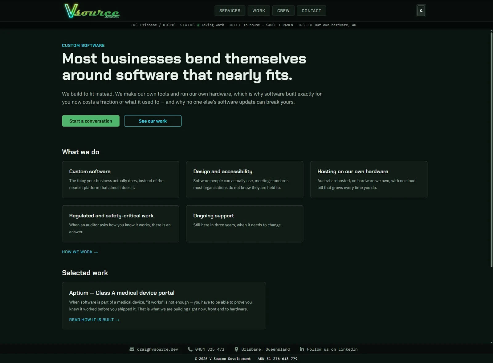
Home, dark — the site’s default, because the logo’s glow only reads on a dark ground.
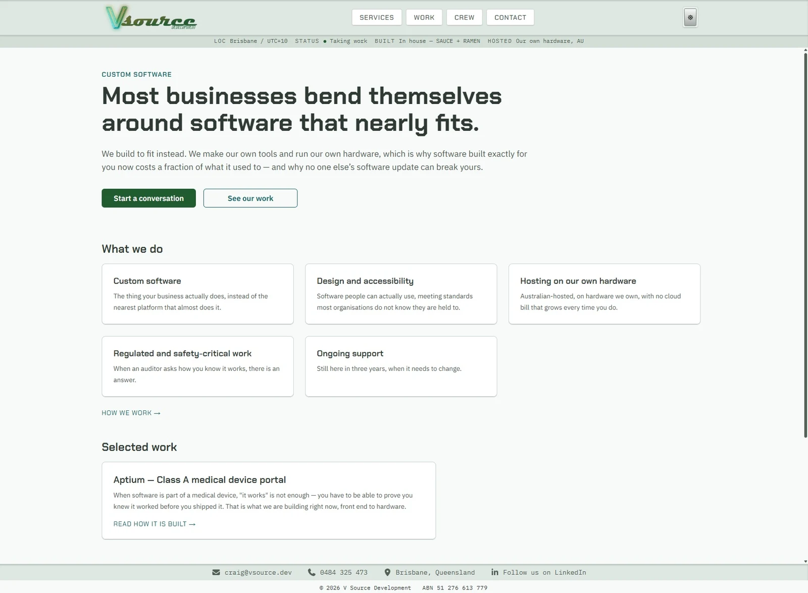
Home, light — the same page. Every surface is solved from its contrast ratio to the page, not by inverting it.
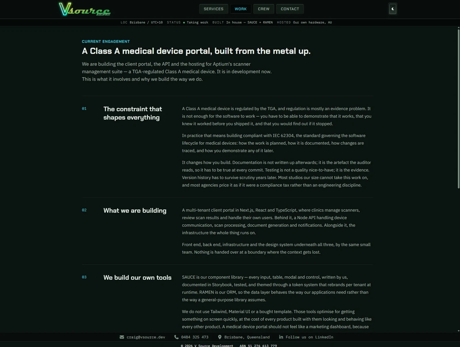
A different page, the same system — numbered sections, sticky headings, one measure for the prose.
"Can I see something you have built" is the fair question, and a regulated product still in development is a bad answer to it. This one is live, it is public, and you can open it in another tab and poke at it while you read this.
It is also the most honest thing I can show you, because this site started as a copy of it. The layout you are looking at, the etched surfaces, the theme system, the component library underneath — all of it came from there, and all of it is mine to take.
02
Depth without a single drop shadow
Every surface on both sites is defined by its edge rather than by a shadow cast onto the page. Nothing floats; things are cut into the surface or raised out of it, using inset shadows and a light source that stays in one place. It is a harder way to build an interface and it is why neither site looks like a template.
The steps between surfaces are deliberately tiny — a contrast ratio of about 1.1:1 between a card and the page it sits on. Big enough that the eye reads an edge, small enough that it never reads as a box. Getting that wrong in either direction is what makes most sites look assembled.
03
Accessibility as a build constraint
WCAG 2.2 AA from the first commit, with contrast measured rather than eyeballed — every palette on both sites failed its first audit, which is the argument for auditing rather than trusting your eye.
Motion is scroll-driven CSS rather than a JavaScript animation library, so it costs nothing at runtime and honours a reduced-motion preference by simply not running. Nothing on either site is gated behind an animation: turn JavaScript off and every word is still there.